
Showing posts with label SUMMER11. Show all posts
Showing posts with label SUMMER11. Show all posts
05 August 2011


02 August 2011

01 August 2011
29 July 2011
UNIT III: Vector
PROJECT: Now blind, how we see the stars
OBJECTIVE: Technical: To gain a basic understanding of vector based digital imaging software (Illustrator) and using raster images within it.
Conceptual: To explore how images and text generate a range of ideas and emotions, and to better understand how design and text can be utilized to market and advertise particular products (outside and inside the art realm).
GOAL: Make a data map from a topic that interests you
PROCESS:
1. Research Data.gov to find a dataset on a topic that interests you.
2. Use the chart feature in Illustrator (or Excel) to get a quick visual of your data. Do Not Use The Chart Tool In Your Final Piece.
3. Sketch 5 different layouts or ways to represent your particular data set. Look at the references for inspiration.
4. Create a new Illustrator print document 8.5” x 11”.
5. Using shapes, text, and lines, begin laying out your informations
6. Remember to use rulers, guides, align, the grid, and snaps to help you arrange design elements. (Look for them in the View menu.)
7. Consider the significance of the size and color of certain design elements when compared to others.
8. Save your work and upload a jpg to the blog.
VOCABULARY: Type, Glyph, Typography, scale, size, proportion, context, serif, font, typeface, vector
REFERENCES:
Edward Tufte - http://www.edwardtufte.com/tufte/
See Something Say Something - http://www.flickr.com/photos/walkingsf/with/5925793753/
Infographics News - http://infographicsnews.blogspot.com/
US Govt. - http://www.data.gov/
DUE: 8/5/11
GRADING:
TECHNICAL: (6pts) Did you compose text and images into a believable poster? Did you use the resolution, bit depth, and color mode the assignment called for? |
AESTHETIC: (6pts)Are your final pieces compositionally balanced? Did you make good use of color? Does your piece lead the viewer’s eyes? Is it readable? |
CONCEPTUAL: (6pts) Does your final piece address the theme in a clear way? Is the “whole more than the sum of its parts”? Does your final image address the themes proposed for this assignment? |
RESPONSABILITY: (6pts) Were you prepared for each class? Did you bring the rough sketches/ideas on the due date? Did you upload your image to the class blog on time? Did you work during work hours? PRESENTATION For your final critique you will have ten minutes to present your work, followed by ten minutes of feedback. Items you should include in your presentation are your final piece, how you made it, your original sketches, what data you used, where the data came from, how the data was originally collected, and your motivation / concept for making this piece. I recommend putting together a brief power point to show this information. |
21 July 2011
UNIT VII: Web
UNIT VII: Web
PROJECT: Our triumphant rise casts shadows on the sand
OBJECTIVE: Understand website linking structures, ease of use, interaction design, readability, and self promotion through a well customized blog.
GOAL: Your challenge is to create a portfolio website to showcase the work you've done over the course of the semester.
PROCESS:
1. Go to blogger.com and create a google account or sign in with your existing account.
2. Create a new blog giving it a name and theme.
3. Go through all the tabs an set your preferences for settings. How do you want the date to appear? Do you want to allow comments?
4. Create new posts for all of your work from this class giving them appropriate categories. You can add other work you have made, too. Be sure to have a photo for each piece as well as listing the date made, materials, title, dimensions, and media. You can add a description as well.
5. Create Pages for your artist statement, resume, and biography. If you need help with formatting these check http://www.artstudy.org/art-and-design-careers/artist-statement.php and http://www.collegeart.org/guidelines/resume
6. In the design tab edit your theme template so that it has the background images and text colors you want. Also choose a layout.
7. Then setup your page elements by adding and arranging widgets. Be sure to add one for labels. When done appropriately it is hard to tell if an artist’s website is a blog or a standard site.
8. Finally, email me a link to your new website
READING: Launching the Imagination Chapter 6
Digital Design Media Chapter 14
VOCABULARY: hypertext markup language (html), browser, server, tags, link, source, host, file transfer protocol (ftp) embed, hex color, template, post, page, widget, side bar
REFERENCES: Ken Renaldo, Scott Snibbe, Paul Sermon, http://www.comfab.org
DUE:
GRADING: (20pts)
Technical: (12pts) Does your site link structure make sense? Do you have a bio / artist statement / resume? Are all your projects posted?
Aesthetic: (8pts) Is your site pleasing to look at? Do the color choices make sense?
19 July 2011
Carrie's Animal Rights Posters
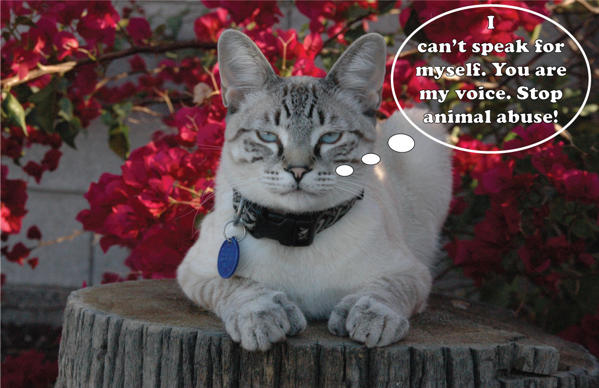

I love all animals (except creatures like gremlins and orcs) and we should treat them the way we would want to be treated, with kindness, compassion and respect.
Jamie's Poster

My poster is based on the issues that trans people (transgender/transsexual/gender variant) have to deal with regarding bathroom use. The fact is, many people in the general public are not educated regarding transgender issues, and there is still a stigma regarding the use of gender designated bathrooms by trans people. While in some places there are gender neutral restrooms available, sometimes this is not an option. But transgender people should not have to worry about using a gender designated restroom when they have to.
Rachael's Propaganda
I am really passionate about the idea that everyone deserves the opportunity for not just an education, but a great education. My propaganda posters address two separate issues with education funding.
 My first poster deals with issue of rising tuition prices for higher education institutions. I chose my color scheme based on the ASU's colors because I felt that, though this issue is a national problem, it grounded my message to have it apply to this specific university. I wanted to utilize sarcasm in this piece, and have done so with both the text and the text's juxtaposition with the image of the laughing students.
 For my main propaganda poster, I created an image that addresses the issue of underfunding in the Arizona public education system. I chose the series images used based on their prevalence to the issue at hand: I wanted the center focus to be on a young child wearing a sale price sticker. This, I feel, emphasizes the ridiculous idea of skimping on education funds. I wanted to connect the idea of money with a child because it gives the viewer a concrete and more personal connection to the issue. Seeing as the goal of the project was "to propagandize", I felt that a red, black, and grey color scheme fit best. For the text, I wanted to keep it as concise as possible while still making my point. Also, I threw in the Arizona flag rays into the background, to both give the composition a more balanced weight and connect it to Arizona.
EDIT: Second draft. An improvement?

Alex's Propaganda


The astronaut poster is of course a reference to the current state of NASA, and was inspired by the World War Two posters asking people to buy war bonds to fund the war. The second poster is a warning about posting too much information online, and how once something is posted, you lose control over where and how it is displayed. For this poster I drew inspiration from the dark and macabre propaganda posters of yore.
18 July 2011
Yixuan Wang Project 2


This my work for project two. My idea came from some funy sentences, I make them look like more funy. However, the frist one (blue one), it looks funy, but it also has sad story. The fox love a rabbit, he wants to make his ear like rabbit beacuse he thinks may be he has longer ear, rabbit will love him, but it is not. The rabbit still doesn't care him. Finally, the fox died beacuse he puts him on clothes hanger too longer. The story has a little sad, but it also told us that sometime you change yourself, you still cannot change other people thinking or something eles. The other one is funy, but it also has meaning, it told us that sometime some things you don't know too much that will be better.
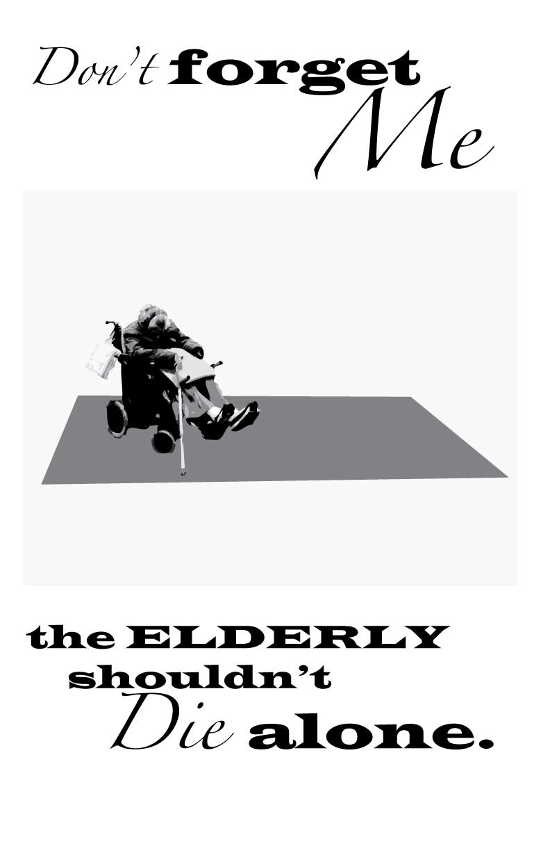
Anti-Ageism Propaganda

16 July 2011
lucas work. mixed with PS & AI..


Simple,
Pellucid,
Something like the warning
is the key words of making a public service advertisement, especially smoking this topic.
Instead of using the awful pictures which show the harm of smoking, I choose a smooth but clear way to express my idea. With a black background, audiences can pay more attentions to understand the meaning of these pictures. No more special details to divert their attention, people can easily remenber the whole picture in a few seconds. And by using this method, the pictures can earn more time for people to think about what is behind these.
The final goal of a smoking public service advertisment is to make people think back to it when going to smoke and stop. The more simple more clear the propaganda is, the more probability for people to recall it. And that's why..
LESS IS MORE.
Subscribe to:
Posts (Atom)